|
Administrative /
LUGNET Logo/ |
The LUGNET logo is an original graphic design inspired by the works of Dutch artist M.C. Escher and by the famous "impossible triangle" discovered by English mathematician Sir Roger Penrose. Makes your brain hurt? Ours too. But that's what we like best about it. We wanted a fresh, bold, colorful look which would suggest rectangular construction toy bricks and could also represent the magical geometry of a hyper-connected online community and super-database. We also needed a design which looked distinctly unofficial in nature and maintained a careful distance from the trade dress of the LEGO Group, so as not to cause confusion with their products or appear sponsored by the LEGO Group. Thus, the elements in the LUGNET logo are distinctly different from LEGO® bricks in at least four ways: (1) they are colored differently on different faces of the same element; (2) they have visible studs on all sides, as opposed to the top only; (3) their aspect ratio is 1:1, as opposed to 5:6 (in other words, they are cubic, as opposed to rectanguloid); and (4) they cannot be modeled in real life because they join to form an impossible object. If you would like to see more brain-twisters based on this design, here are a few sketches below. The first image combines four copies of the design into a single block. The second image, inspired by Escher's Verbum and Waterfall prints, uses a version of the design which tessellates the plane. The third image is an early study combining the impossible triangle idea with a trippy blacklight effect. Todd Lehman & Suzanne Rich P.S. — All images on this page are ™ and ©1998 by Todd Lehman and Suzanne Rich. The images below must not be used or republished anywhere without permission. 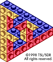 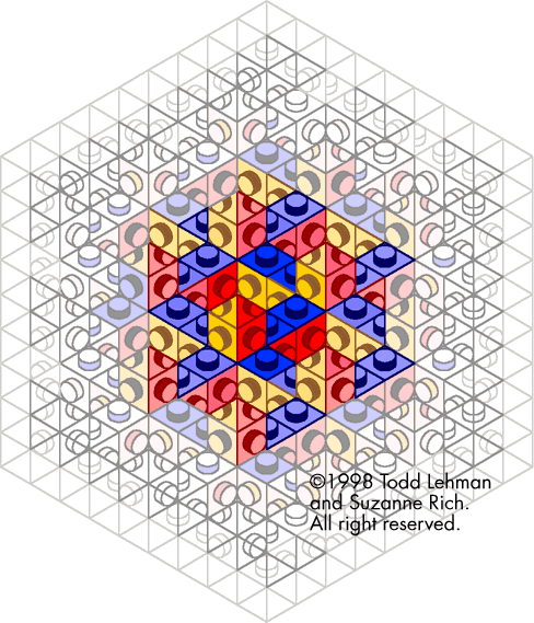 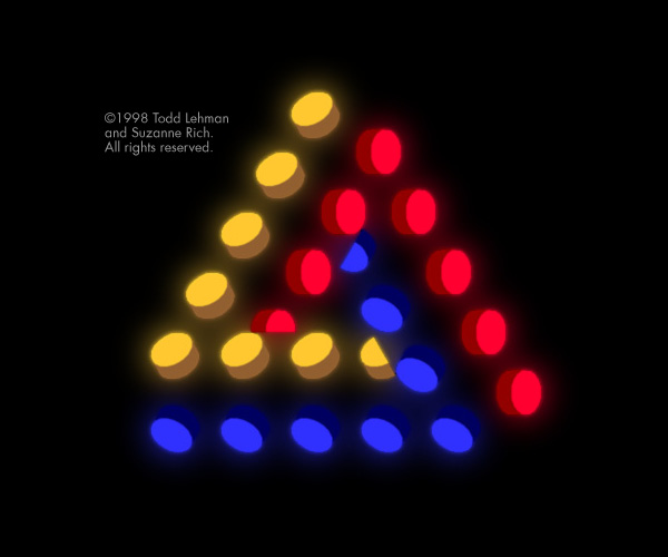 |
| Site Map | Terms of Use | Feedback |
©1999 LUGNET. All rights reserved. |